Statistics.gov.scot improvement project: discovery user research report
The research aimed to understand the current user needs and expectations of the Scottish Government’s site for open access to Scotland’s official statistics: statistics.gov.scot. This programme of user research is one workstream of the discovery project to improve statistics.gov.scot.
Appendix D – Co-design session materials
Outline
Introduction (5 mins)
The story so far… Show interim findings, concentrating on areas for improvement.
Exploration of similar services (10 mins)
Demo (5 mins): Show 2 or 3 similar services (e.g. from Ireland, HESA, PHS) focusing on layout, language, flow, search, and features.
Discuss (5 mins): What do participants like about these services? Does anything look particularly inviting? What don’t they like? How do they compare to the statistics.gov.scot website?
Sketching (30 mins)
Demo sketch (5 mins): Login flow to portal - not directly related to this site but showing familiar elements, e.g. buttons, user input, validation, navigation, tabs etc.
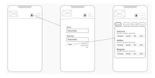
Concept/wireframe sketching (groups, 15 min): e.g. 2x4 panels on paper showing an idea/feature to achieve a specific goal, based on sketching ideas. If remote/hybrid then use Mural in breakout room.
Concept presentations and discussion (10 mins): each group present their ideas (and how these address the brief), feedback from wider group plus short discussion.
Thanks, next steps (5-10 mins)
Thanks all, here’s what we did today and here’s what’s next.
User journeys for sketching
Journey 1: Where to start?
Why?
- The site does not offer an intuitive user experience.
- Overwhelming volume of text and confusing terminology.
- The presence of two search bars.
- Lack of supporting information for the list of organizations.
Design task:
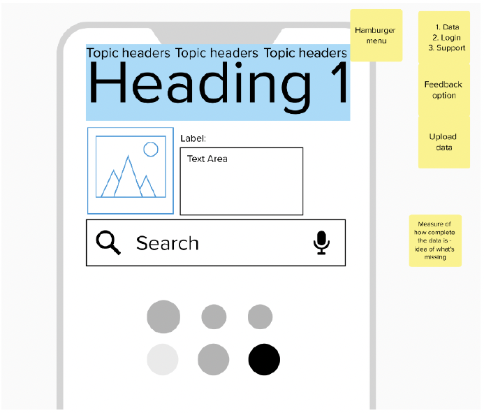
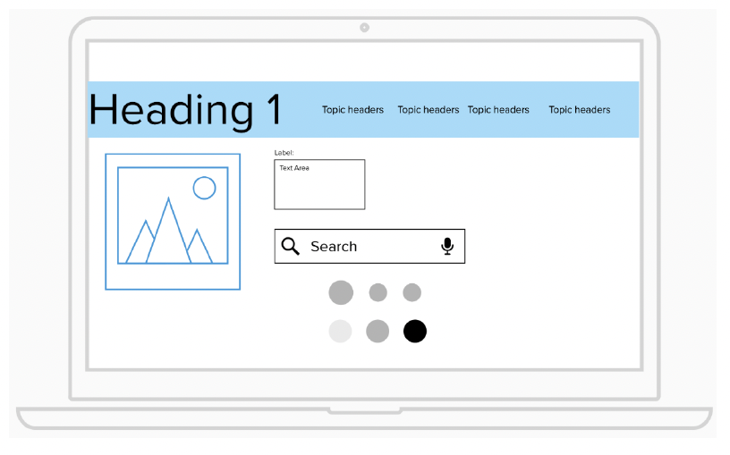
- What does a good homepage look like, and what does it do?
- Redesigning the navigation structure to make it more intuitive.
- Reducing text volume - using clearer, simpler language.
- Consolidating the search functionality.
- Things to think about:
- Clear layout.
- Clear information/navigation
- Single search bar placement.
- Quick links/prominent elements.
- Intuitive design.
Journey 2: Search party!
Why?
- Ineffective and confusing search functionality.
- No advanced search options.
- Lack of search result suggestions and related datasets.
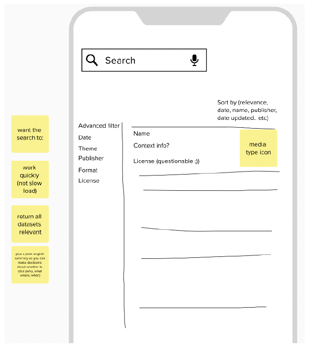
Design task:
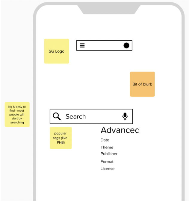
- What does a good, user-friendly search look like, and what does it do?
- Incorporating features like auto-suggest, advanced search, filtering, and related datasets.
- What do the search results look like?
- Things to think about:
- Search page.
- Advanced search.
- Filters.
- Results page including level of detail in results.
Journey 3: Discovery channel(s).
Why?
- Browsing site and discovering different datasets not always intuitive.
- Destinations not always clear from ‘Browse by…’ themes, areas and organisations.
- Dataset browsing and landing pages, instructions, and tabs are unintuitive.
Design task:
- What does a good, user-friendly data browsing journey look like, and where does it take the user?
- Start with a ‘Browse by…’ option – could be by theme, organisation etc. – whatever you think would be useful.
- How would you navigate around from each stage of the journey, e.g. breadcrumbs, tabs etc.?
- Things to think about:
- How should the initial ‘Browse by…’ page look?
- Each stage of the ‘Browse by’ journey, e.g. sub-categories etc.
- Information and navigation at each stage, e.g. descriptions, metadata, contextual information, summaries, previews.
- Inspiring users to find different/related datasets.
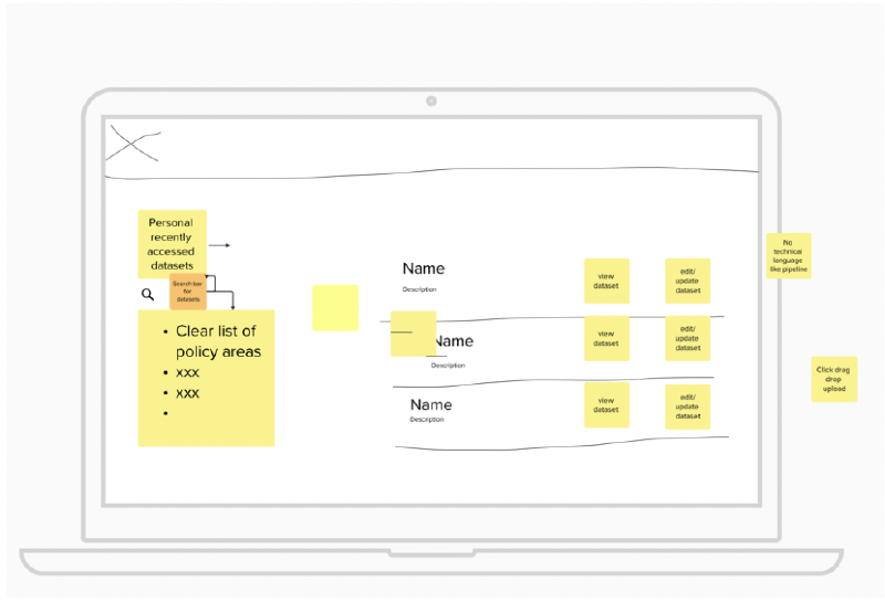
Journey 4: Providing data.
Why?
- Data providers find the process for uploading and updating datasets challenging and counter-intuitive.
- Some participants keep their own step-by-step guidance due to the complexity.
Design tasks:
- What does a good data upload process look like?
- What does a good data update process look like?
- Develop clear interfaces and simple journeys specifically for data providers.
- Things to think about:
- Login screen.
- User dashboard.
- Upload guidance or ‘wizard’.
- Validation.
- Submission.
- Confirmation messages – what’s useful here?
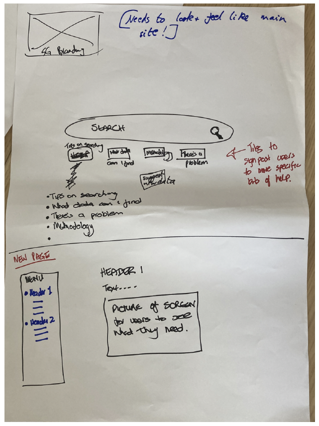
Journey 5: Help!
Why?
- Users don’t find the current online help and guidance pages useful.
- The current pages appear outdated and inconsistent in design.
Design task:
- What does good help and guidance look like?
- Might include examples, videos, step-by-step guidance etc.
- What are the design elements? Cards, accordions, FAQs etc?
- Things to think about:
- How does the user get to online help?
- Help landing page layout and categories.
- General users and data publishers.
- Search function?
- ‘Offline’ elements? E.g. feedback, asking questions.
Journey 6: Is anybody out there?
Why?
- There is limited opportunity for communication and interaction through the site.
- Finding useful contact information for data publishers can be difficult.
- E-mail is the only mechanism for providing feedback to the statistics.gov.scot team or data publishers.
Design task:
- How might users, data providers, the wider data community, and the statistics.gov.scot team better communicate and provide feedback through the site?
- What might those options look like?
- ‘Suggest a dataset’ with comments section?
- Forum?
- Feedback form or comments section…for each dataset?
- Things to think about:
- Getting in touch with data publishers.
- Getting in touch with the statistics.gov.scot team.
- General and specific feedback.
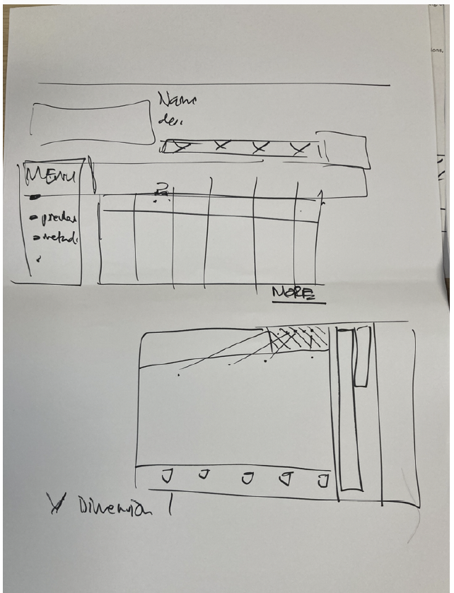
Journey 7: Now what?
Why?
- Dataset landing page, instructions, and tabs are unintuitive.
- Sometimes difficult to find download links at bottom of dataset page.
- Dimension-locking feature is confusing and actively avoided.
Design task:
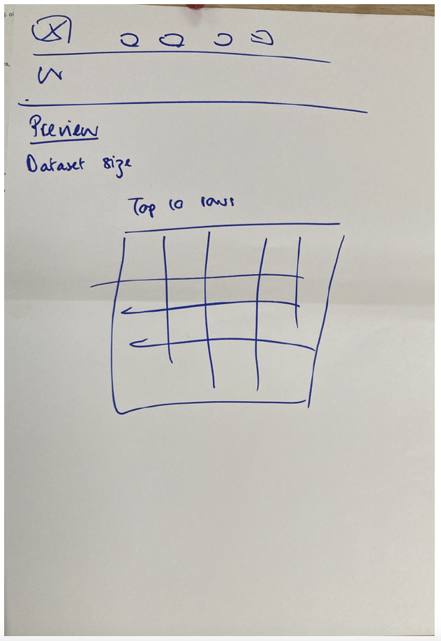
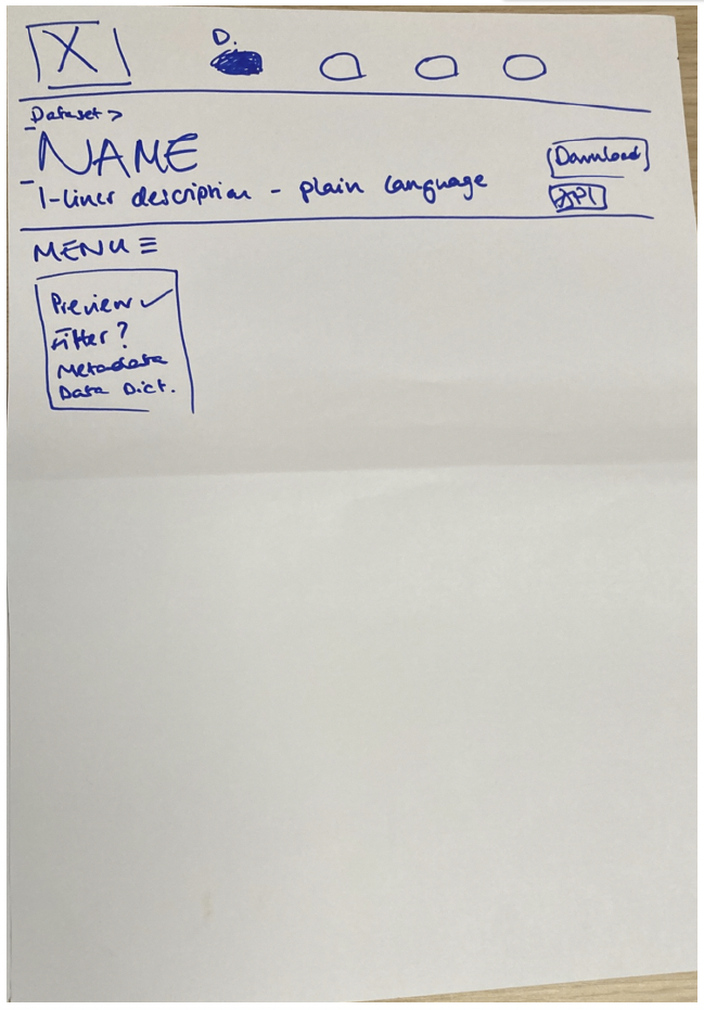
- What does a good, user-friendly dataset landing page look like, and what does it do?
- How is the current dataset presented on screen?
- What can you do with the data?
- How would you navigate around to find relevant info, e.g. older datasets, publishing schedule?
- Things to think about:
- Clean layout with download option easy to find.
- Previews?
- Examples of use?
- Comments/feedback?
- Information on the dataset landing page, e.g. descriptions, metadata, contextual information, key statistics/insights.
- Related datasets.
Participant sketches:
Journey 1: Where to start?
Journey 2: Search party!
Journey 4: Providing data
Journey 5: Help!
Journey 7: Now what?
Contact
Email: auren.clarke@gov.scot
There is a problem
Thanks for your feedback