Wellbeing economy monitor
The monitor brings together a range of indicators to provide a baseline for assessing progress towards the development of a wellbeing economy in Scotland.
7. Charts in detail
Natural capital

Source: Scottish Greenhouse Gas Statistics 2020; OECD
Figure 2 shows greenhouse gas emissions per capita. For Scotland, this value has fallen from 12.1 Mt per capita in 2010 to 7.2 in 2020. Land use, land use change and forestry (LULUCF) emissions have been omitted from this comparison as Scotland has recently begun to include additional wetlands emissions in the Scottish Greenhouse Gas inventory, rendering any comparisons with other nations including LULUCF potentially misleading.
Scotland has a net zero emissions target date of 2045.

Source: NatureScot
Figure 3 shows the three metrics that compose Scotland's biodiversity index. The marine abundance index fell from 2000 to 2012 before recovering slightly from 2012 to 2018.
By 2018 it stood at 64.6% of the 1994 level. Between 2000 and 2004, the terrestrial abundance index was rising, but then fell for most of the period from 2004 to 2016, when it reached 68.7% of the 1994 level. The terrestrial occupancy index rose from 118.8 to 124 over the period from 2000 to 2016.
Human capital

Source: OECD
Figure 4 shows the proportion of adults aged 25 to 64 with lower secondary education level educational attainment or less in Scotland, Finland, Iceland and Wales[1]. In 2021, the latest year for which we have comparable data, for Scotland this figure was 19.3%. This was higher than Finland (11.0%) and Iceland (18.0%) but lower than Wales (21.8%). This OECD measure is similar to the measure of low or no qualifications reported in the National performance Framework (NPF), however the OECD measure includes those who don't know their highest qualification level while they are not included in the NPF measure. There is also a further small difference in the qualifications included within both measures.

Source: Poverty and Income Inequality in Scotland 2017-20
Figure 5 shows the proportion of children in combined material deprivation and low income after housing costs (below 70% UK median income) has remained broadly stable over the period. Due to a change in methodology there is a break in the series.
The Child Poverty (Scotland) Act 2017 sets out targets to reduce the proportion of children in poverty by 2030. The targets state that by 2030, of children living in Scottish households: less than 10% should be living in relative poverty (how many families are on low incomes compared with middle income households); less than 5% should be living in absolute poverty (how many low income families are not seeing their living standards improving over time); less than 5% should be living with combined low income and material deprivation (how many lower income families cannot afford basic necessities); less than 5% should be living in persistent poverty (how many families live on low incomes three years out of four).

Source: Scottish Household Survey
Figure 6 shows the proportion of short journeys taken by walking or cycling. For walking, the percentage of journeys under 2 miles was 48.5% in 2012. It has fluctuated between 43% and 51.3%. It was at 47.6% in 2019. The percentage of journeys under 5 miles taken by cycling has remained between 1.2% and 1.8% throughout the period from 2012 to 2019. It was 1.7% in 2019.

Source: Avoidable mortality | National Records of Scotland
Figure 7 shows that for preventable deaths, the age-standardised death rate per 100,000 in Scotland fell from 293.2 in 2001 to 207.3 in 2014. It remained relatively consistent over the years to 2019, but rose from 214.3 in 2019 to 241.3 in 2020. Note that the 2020 figure includes deaths from COVID-19 and illustrates that the increase in overall avoidable mortality in 2020 was largely due to the inclusion of COVID-19 as a preventable death by the OECD.

Source: Poverty and Income Inequality in Scotland 2017-20
Figure 8 shows the percentage of individuals living in private households with an equivalised income of less than 60% of the UK median after housing costs. This proportion had been falling slightly between the late nineties and the lowest point in this time series in 2009-12. After that, it started to rise again up until now, where the rise appears to have stopped.
Social capital

Source: Annual survey of hours and earnings: 2021; OECD
Figure 9 shows the gender pay gap for full-time employees median gross weekly earnings in Scotland narrowing over the period from 2014 to 2021 overall, despite a slight increase from 10.0% in 2020 to 10.5% in 2021. Scotland's gender pay gap is seen to be larger than that of New Zealand but smaller than those in Canada and Finland throughout the period. Gender pay gaps are reported in Scotland's National Performance Framework in terms of gaps in hourly earnings. In this case weekly earnings have been used to allow international comparison.

Source: Annual Participation Measure | Skills Development Scotland
Figure 10 shows the percentage of young adults (16-19 year olds) participating in education, training or employment rising from 90.4% in 2016 to 92.2% in 2021.
Produced and financial capital

Source: GDP Quarterly National Accounts: 2021 Quarter 4 (October to December) ; OECD
Figure 11 shows investment measured by Gross Fixed Capital Formation (onshore) as a percentage of GDP. It shows Scotland below the comparator countries in 2021 (the latest year for which data is available), at 16.6% while the comparators are clustered between 22% and 24%.

Source: Annual Survey of Hours and Earnings
Figure 12 shows the proportion of employees aged 18 and over earning less than the living wage. Living wage rates are calculated annually by the Resolution Foundation and are overseen by the Living Wage Commission. The proportion of employees earning less than the real living wage has decreased from 18.8% in 2012 to 14.4% in 2021.

Source: Poverty and Income Inequality in Scotland 2017-20
Figure 13 shows income inequality in Scotland as measured by the Palma ratio (the total income of the top ten percent of the population divided by the total income of the bottom forty percent of the population (written as a percentage). It fluctuates throughout the period, reaching a high of 132.7% in 2007-10. It is currently decreasing from the most recent high in 2015-18.
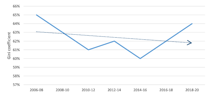
Source: Wealth in Scotland 2006-20
Figure 14 shows the Gini coefficient[2] of wealth in Scotland. The Gini coefficient of total wealth was 64% in 2018-2020. It had been broadly stable since 2006-2008, when data collection began, ranging between 60% and 65%.

Source: Community ownership in Scotland
Figure 15 shows the number of assets in community ownership, as at December 2020, increased from 82 in 2000 to 612 in 2020. Note that where the year of purchase or transfer of the asset is unknown, it has been defaulted to 2000, the start of the series.
Contact
Email: polly.legrand@gov.scot
There is a problem
Thanks for your feedback